Retina screens, or screens that contain 2x the pixel density of regular screens, are becoming more widely used in an increasing number of products.
One area where it’s easy to forget about retina-friendly images is in your blog content. Don’t put off updating your images any longer: it is easier than you might think.
Create the Correct Image Width
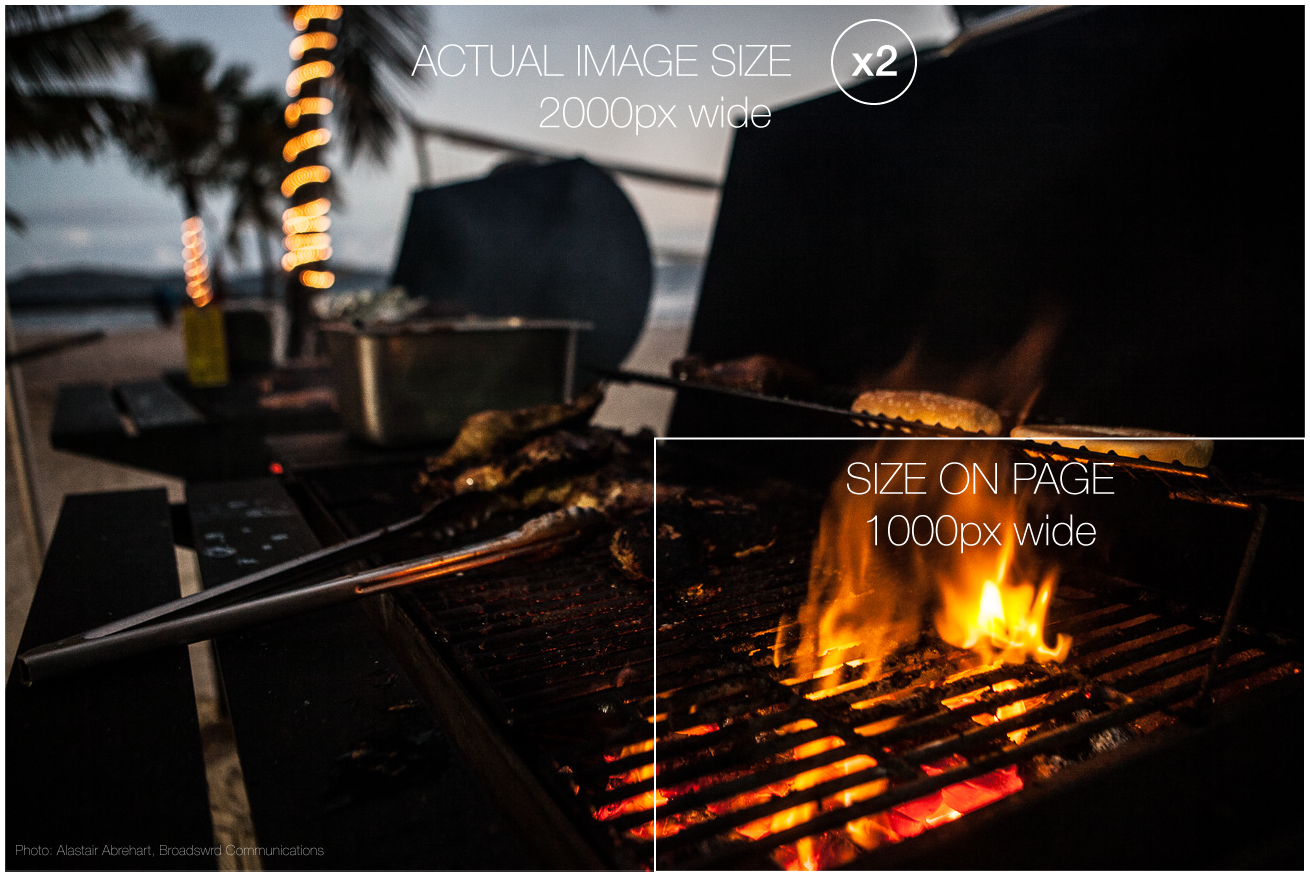
The dimensions of the image are key to creating images for retina. Make your images twice the width of the space allowed. If the area in your blog for images is 700px wide by 500px high, increase that size to 1400px wide by 1000px high. All images should already be 72 dpi (dots per inch) and this also applies to retina-ready images. Please note that you cannot take existing 700px wide images and scale them up in Photoshop. You must begin with a double-width image (from scratch if you have to).
How to Use the Retina-Ready Images In Your Blog
Upload your photos to your blog as normal but set them to to match the space in your content. Manually set the width of your images to be exactly half its actual size. For example, if you are uploading an image for a 700px wide blog content, upload the 1400px image and then set width=”700″ (or 100%) within the img tag.
Should You Update All of Your Site Images?
Now that your new images look good on Retina screens, should you update all of your existing images? Not necessary but there are some you may want to concentrate on. Update the images that occur multiple times such as those in your header, sidebar and footer. Images on your static pages such as your About page and Portfolio pages should also be updated.
Once you have created these double-width images, update the images for the most popular blog posts on your site.
Read more on this topic:


