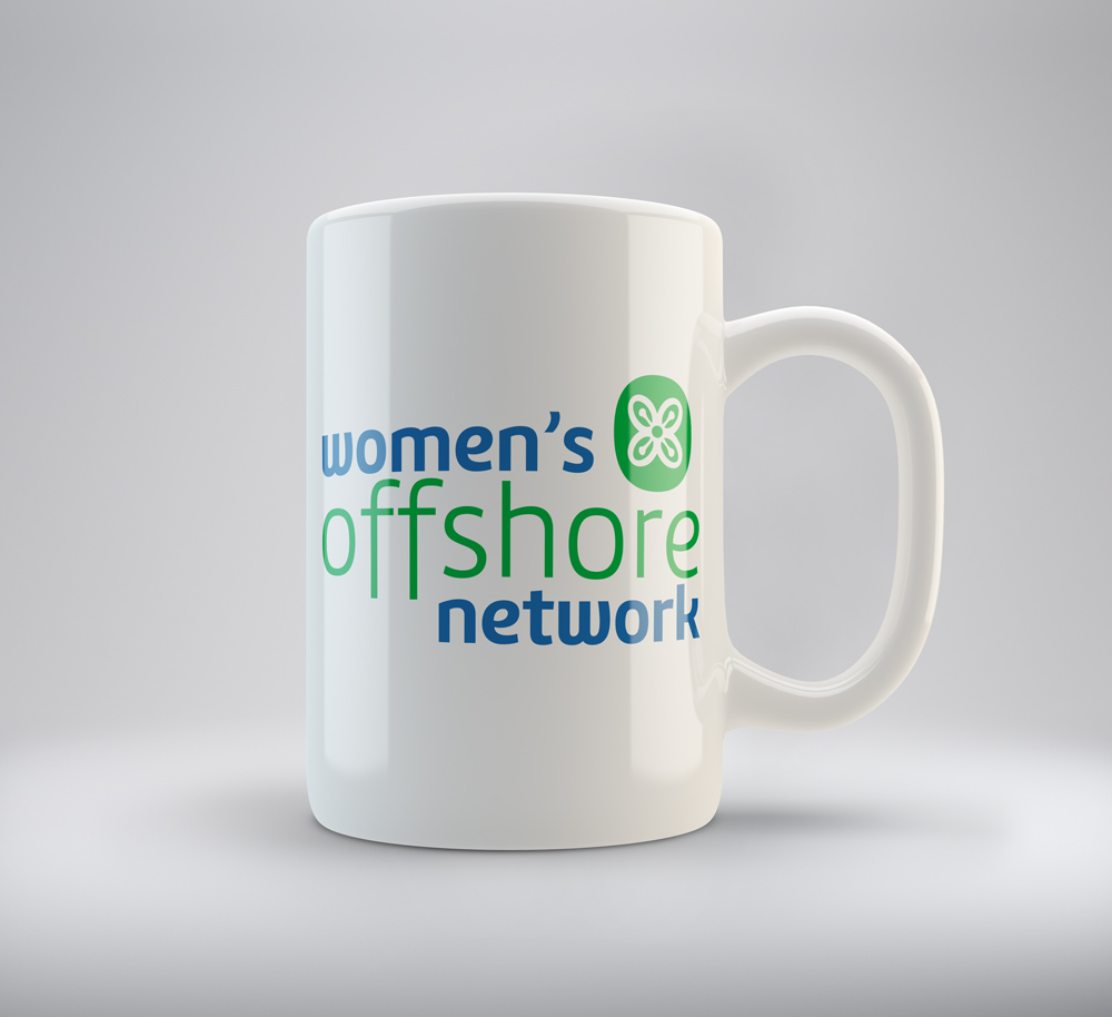
We recently developed a logo for the Women’s Offshore Network (WON), a new networking initiative for women working in the financial services sector. The purpose of the BVI-based enterprise is to provide networking opportunities and enable like-minded female professionals to forge relationships.
With this ethos in mind, we set about developing a logo that would be an accurate representation of this new organisation and its founding members. These women are successful professionals seeking to create friendships and opportunities for other women in the BVI so it was important we communicated this sense of camaraderie and prosperity.
The English translation of bese saka is “sack of cola nuts” – a widely used cash crop in Ghana that brought the country abundance and prosperity. Cola nuts went on to become a symbol of the role agriculture and trade played in bringing people together.
The next step in the process was to choose the logo colours – an extremely important step in the branding process. We wanted to select colours that would reflect the bese saka symbol and spirit of the Women’s Offshore Network.
We chose green, the colour of nature and health, and blue, the colour of creativity and intelligence. The green encapsulates the sense of plenty and affluence we wanted to express as they are key brand characteristics.
Blue also signifies loyalty, strength, wisdom and trust. We felt this was a complementary to the bese saka characteristics of togetherness and unity.
[blockquote width=’full’]According to Color Matters, leading color psychology and branding experts, “Brands and colour are inextricably linked because color offers and instantaneous method for conveying meaning and method without words”. [/blockquote]
This proves true the old adage, “A picture paints a thousand words”, which is why we were careful to choose colours that were in harmony with the bese saka symbol.
Color Matters recently conducted research which found that colour increases brand recognition by up to 80% and that 60% of the time people decide if they are attracted to a message or not based on colour alone.
Bearing this research in mind, it was important that we create a logo that would result in instant recognition of the Women’s Offshore Network. As a new organisation, it was particularly important to establish brand recognition and awareness. This is also why we opted for a legible but unusual font appropriate for the message we are conveying.
We developed a contracted, more ‘iconic’, version of the logo which retains the colours and the Bese Saka icon. We also made sure the logo would work well in a single colour and a single colour reversed out.
With the new logo now firmly in place, the next step is to spread the word. We are in the process of creating a range of marketing and business collateral including e-mail marketing, t-shirts, caps, cups, mugs, leaflets and letterhead for local distribution. We are excited to be a part of the launch of this organisation and have no doubt that it will provide many opportunities for women in the local community.

